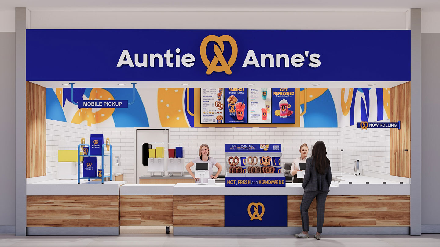
Auntie Anne’s has rolled out a bold new store design aimed at Gen Z and Millennial snackers. The refreshed look features a sleek, modular layout with vibrant blue accents, dynamic signage and signature “twist” murals that evoke the brand’s iconic pretzel shape. A slimmer pretzel logo replaces the long-standing halo, balancing nostalgia with modern convenience to cut through today’s retail clutter.
Key design elements include versatile rolling counters, a “Now Rolling” sign to highlight fresh pretzel preparation, and naturally knotty wall graphics that mirror hand-twisted dough. Purposeful touchpoints—like clearly positioned merchandise displays, frozen beverage machines and a transparent view into the kitchen—turn snack ordering into an engaging experience. Digital menu boards, defined queuing paths and a dedicated mobile pickup zone streamline operations and support growing off-premise demand.
Built for flexibility and cost efficiency, the new format uses durable, modular materials that adapt to inline, streetside and non-traditional locations. Over 150 remodels are slated for 2025, backed by GoTo Foods’ standardized equipment recommendations and vendor relationships to ensure consistency and operational ease across Auntie Anne’s 1,150-unit footprint.
To fuel franchise growth, Auntie Anne’s is offering streetside development incentives for new co-branding agreements signed by December 15, 2025. “This modernized design reflects how we’re evolving to meet guests wherever they are,” said Michael Freeman, president of brands at GoTo Foods. “Our vibrant blues, playful twists and sleek logo keep us culturally relevant and ready for future growth.”